
A Limited Color Palette Makes Your Art BETTER!
- Melanie Grant

- Aug 12, 2025
- 4 min read
TRANQUIL • LUMINOUS • ROOTED
Stories from the studio, reflections on process, and the art of the handmade.
There’s a sweet kind of freedom that comes from having fewer choices.
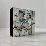
When I sit down to make a new piece—or a full series—I almost always start by choosing a limited color palette. Not a dozen tubes of paint and stacks of papers in every hue imaginable, but a thoughtful, curated handful of colors that speak to each other. For me, this is where clarity begins. It’s what narrows my focus and takes the chaos out of the creative process.
I often use a palette of 8 to 13 colors in my creative sessions. That usually includes two versions of each primary—one warmer, one cooler—along with a few “convenience” colors like cadmium orange or yellow ochre. They’re not necessary (I could mix them), but they save time and keep my sessions flowing.
But when I really want to focus—or when a piece calls for it—I go even simpler. That’s where the magic of a limited palette comes in. Working with just three to five colors can completely shift your process in the best way.


What Is a Limited Palette?
Generally, a limited palette includes one version of each primary color plus white. My go-to combination is:
Titanium White
Cadmium Yellow
Cadmium Red
Ivory Black (which acts as a cool blue)
This palette is a variation of the classic Zorn palette, and I keep coming back to it for good reason. It gives me range, flexibility, and simplicity all in one.
With this setup, when I need to shift value, I have two lights (white and yellow) and two darks (red and black). When I want to adjust temperature, I have two warms (yellow and red) and two cools (white and black). Just two options in either direction. It makes color mixing intuitive instead of overwhelming.


Why You Should Try a Limited Palette
Whether you’re painting, collaging, or building books, narrowing your palette can be a creative game-changer. Here’s why:
1. Simplified Color Mixing
Fewer options = clearer choices. When you’re not staring down 40 tubes of paint or a sea of collage scraps, it’s much easier to choose the right next step. You’ll start to really understand how your colors interact, and what happens when they combine.
2. Stronger Color Harmony
Fewer base colors means fewer chances for clashing hues. Everything in your piece is naturally more harmonious because it’s derived from the same foundational tones. The result? A balanced, intentional look.
3. More Focus on Value and Composition
When color choices are simplified, your brain shifts to other powerful tools—contrast, structure, movement, and storytelling. You stop asking, “What color should this be?” and start asking, “What does this part need?”
4. Greater Control of Temperature and Tone
With a limited palette, subtle shifts in warm vs. cool become more visible and controllable. You learn to see color temperature more clearly and gain more precision in your work.
5. Creative Freedom Through Constraint
Boundaries can spark innovation. With fewer colors on your palette, you’re more likely to explore layering, mixing, and alternative approaches. Some of my most exciting discoveries have come when I was “making do” with just a couple of colors.
(For example, one of my recent pieces was created using only transparent oxide red, ultramarine blue, and titanium white—a surprisingly versatile combo where all three primaries are still represented.)
6. It Saves Time, Money, and Headspace
No more analysis paralysis at the paint or paper drawer. A limited palette streamlines your decision-making, reduces unnecessary purchases, and helps you get into flow faster. It simplifies everything from supply lists to cleanup.
7. It Can Help You Build a Signature Look
Some artists are instantly recognizable because of their palette choices. Consistently using a defined set of colors can help develop your personal style—something that collectors and followers come to associate with your work.
Final Thoughts from the Studio
Whether I’m choosing papers for a book series or mixing paints for a canvas, limiting my palette helps me stay rooted in intention. It guides the feel of a piece from the very beginning, and keeps my practice grounded and focused.
If you’ve never tried a limited palette, consider giving it a go. Start with a version of each primary and a white. You might be surprised at how far you can go with so little.
Do you use a limited color palette in your work? What colors do you keep coming back to?
I’d love to hear about your process, your go-to palette, or any creative breakthroughs you've had by simplifying your colors.
Let’s Keep the Conversation Going
Join the conversation with me over on Instagram @melaniegrantdesign—I often share behind-the-scenes views of my studio, works in progress, and tips for working with limited materials.
And if you'd like a deeper look into my creative process—plus early access to new work, thoughtful studio reflections, Join my mailing list to see new finished pieces and get first access to new releases.
Let’s stay inspired—together.


Comments