
Why I Use Neenah Royal Sundance Paper for Bookbinding

TRANQUIL • LUMINOUS • ROOTED
Stories from the studio, reflections on process, and the art of the handmade.
A bookbinder’s very practical love affair with paper, grain direction, signatures, and a surprising amount of math.
When I first started making books, I thought choosing paper would be relatively straightforward.
Find a beautiful paper. Fold it. Sew it into a book.
That lovely little theory lasted about five minutes.
As I quickly discovered, paper has opinions.
There is weight and thickness. Grain direction. Texture. Finish. Foldability. Printer compatibility. Sheet size. How it behaves under thread. How many sheets you can comfortably put into a signature. How much the spine swells after sewing. And, because apparently bookbinding wasn’t complicated enough already, there is the question of how efficiently you can cut a large sheet into the size you need without creating an expensive pile of beautiful scraps.
I am by no means a paper expert. I am still very much a student of bookbinding, and I suspect I always will be. But after making a lot of books, and making my share of mistakes, I have learned which characteristics matter to me many through trial and error.
And one paper has become the workhorse I return to again and again:
Neenah Royal Sundance 70 lb. Text, Smooth.
It isn’t the paper I use for absolutely everything. But for the majority of the handmade books I create, it has become my dependable starting place.

Why I Use Neenah Royal Sundance Paper for Bookbinding.
There are several reasons I use Neenah Royal Sundance paper for bookbinding, but most of them came from experience rather than a specification sheet.
The particular Royal Sundance paper I use is a 70 lb. text weight paper, approximately 104 GSM, with a smooth finish. It is acid-free, FSC certified and contains 30% recycled content.
I purchase it in 11 × 17-inch sheets, also known as ledger size, which gives me quite a bit of flexibility when designing a book.
That size is important to me.
One of the things I didn't anticipate when I began bookbinding was just how much time I would spend doing math.
This was particularly unfortunate because math has never been my strong point.
Apparently, no one thought to mention that making books would involve quite so much calculating.
How large do I want the finished book?
How many pages?
How many sheets per signature?
How many signatures?
How many pieces can I cut from one 11 × 17 sheet?
Which direction is the grain running after I make those cuts?
And how much paper am I going to have left over?
There have been moments when I have stared at a sheet of paper with a ruler, pencil and calculator and wondered whether I was making a book or preparing for an entrance exam.
Eventually, though, those calculations become part of designing the book.
Why 11 × 17 Works So Well for Me
An 11 × 17 sheet is exactly twice the dimensions of standard 8½ × 11 letter paper, and I find that larger format gives me room to experiment.
Rather than buying a different paper size for every book structure I want to make, I can begin with one larger sheet and determine how best to cut it for the book I have in mind.
That matters because I experiment with different binding structures simply because I am curious. Sometimes I want to try a particular construction method. Other times I am working toward a very specific proportion or aesthetic for an artist book.
I want the paper in my studio to give me options rather than dictate what I can make.
And I don't particularly enjoy throwing beautiful paper away.
So before cutting anything, I often work backward from the finished dimensions of the book and figure out how many pages or folios I can get from each sheet.
It took me countless hours of playing with dimensions and cutting configurations to begin understanding all of the possibilities.
That probably sounds tedious.
Oddly enough, I now find it rather satisfying.
About That 70 lb. Text Weight
Paper weights can be surprisingly confusing because a 70 lb. text paper is not remotely the same thing as a 70 lb. cover stock.
The number alone doesn't tell the entire story.
Text paper is made from a different standard parent-sheet size than writing or bond paper, which is why papers that feel very similar can carry completely different pound ratings. GSM, grams per square meter, is often a more useful way to compare papers across categories.
Royal Sundance 70 lb. Text is approximately 104 GSM.
For my books, that lands in a very useful middle ground.
It has enough substance to feel lovely in the hand, but it isn't so heavy that a stack of folded sheets immediately becomes bulky. It folds well, accepts printing, and works comfortably in the kinds of sewn signatures I use most often.
That last part turned out to matter much more than I understood when I began.
Then I Met Spine Swell
Spine swell was another one of those bookbinding terms I didn't fully appreciate until I actually experienced it.
You begin with a lovely stack of folded signatures. Everything looks orderly and cooperative.
Then you sew them.
Suddenly the spine of the text block is thicker than the fore edge.
Hello, spine swell my old friend, you have come back to visit again.
Some swell is normal in a sewn book, but too much can affect everything that follows, from how the text block sits to how the cover fits and ultimately how the finished book opens and behaves.
The thickness and softness of the paper, the number of sheets in each signature, the number of signatures, the thread you use and even your sewing tension can all influence the amount of swell.
Paper plays an interesting role because the sheets need to accommodate the thread sitting inside each fold. A paper with enough substance and flexibility can compress around that thread rather than allowing it to create excessive bulk.
This is one reason I've come to appreciate a good text-weight paper.
I don't want every sheet inside my book to behave like a piece of cardstock having an argument with the thread.
How Many Sheets Belong in a Signature?
This is where bookbinding becomes wonderfully dependent on the particular book.
There isn't one magical number.
A signature is simply a group of folded sheets nested together and sewn through the fold. More sheets in a signature can help compress the sewing thread, but adding more sheets also creates a thicker individual section. More signatures mean more sewing, and potentially more overall spine swell.
Paper thickness changes the equation too.
When I work with a heavier mixed-media paper, for example, I may intentionally use fewer sheets per signature or fewer pages in the book.
That's part of the fun for me.
I don't expect every paper to behave the same way.
Instead, I design the structure around the material.
But when I want a reliable paper for writing, sketching, printing or simply creating a beautiful blank book, Royal Sundance gives me a familiar starting point. I already have a pretty good idea of how it will fold, sew and behave.
There is something very freeing about eliminating at least one variable.
Bookbinding provides plenty of others.
Grain Direction: The Lesson Every Bookbinder Eventually Learns
And then there is grain direction.
If you are new to bookbinding, this may be the thing that initially makes you wonder why no one warned you that paper apparently has a preferred direction.
Paper fibers tend to align predominantly in one direction during manufacturing. That direction affects how easily the paper folds, bends and responds to changes in humidity.
In a traditionally constructed book, the grain of the paper should run parallel to the spine.
Once I understood that, choosing sheet size became even more important.
It isn't enough to ask:
Can I cut this sheet into the dimensions I need?
I also need to ask:
After I cut it, will the grain still be running in the direction I need it to run?
Cue more paper math.
The Royal Sundance sheets I use are grain long, meaning the grain runs parallel to the long, 17-inch dimension of my 11 × 17-inch sheets. That detail matters enormously when I am planning how to cut a sheet into signatures.
I learned this one the expensive way.
In my early days of bookbinding, I bought 11 × 17-inch paper assuming the sheet size was really all I needed to know.
It wasn't.
The paper arrived grain short, which dramatically limited the way I could cut my signatures while still keeping the grain parallel to the spine.
Suddenly my wonderful, economical Amazon find of 11 × 17-inch sheet wasn't nearly as economical as I thought.
Now grain direction is one of the first specifications I check before ordering paper which is noted in the fine print, description of most papers. With Royal Sundance, knowing that my 11 × 17-inch sheets are grain long allows me to work backward from the finished dimensions of the book, plan my signatures efficiently and make much better use of each sheet.
It also helps keep that expensive pile of beautiful scraps I mentioned earlier to a minimum.
Yet another lesson filed under: things I didn't know I needed to know about paper.
The Color Matters Too
There is another reason I keep Royal Sundance in the studio that has very little to do with specifications and quite a lot to do with how I want a finished book to feel.
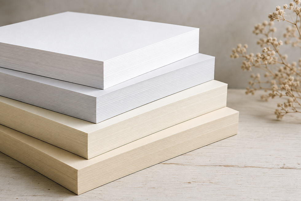
The paper has a very subtle heathered quality to it. It isn't heavily flecked or obviously textured, but there is just enough visual variation to keep the surface from feeling completely flat.
I love that.
Royal Sundance is available in seven colors, and I currently keep three of them in my studio.
Because while white paper certainly has its place, I don't always want stark white pages inside a handmade book.
Sometimes I want something softer.
A warmer or more nuanced sheet can completely change the relationship between the interior pages, the cover paper, the thread and the other materials I am using. And because I tend to think about a book as a complete object rather than simply a stack of pages inside a cover, those subtle differences matter to me.
Aesthetic is part of the decision.
I may begin by asking whether a paper will fold properly, sew well and work with the structure I have in mind, but eventually I also ask:
Does it belong in this book?
That question is every bit as important.
One of the pleasures of having several Royal Sundance colors already in my inventory is that I can lay them beside the materials for a new book and see which one feels right before I ever begin cutting.
Sometimes the answer is white.
And sometimes white is simply too white.
It Also Goes Through My Printer
This sounds decidedly less romantic than discussing the feel of paper beneath your fingers, but it matters enormously in my studio.
I sometimes print on the pages I use in my books.
That means I need a paper that not only folds and sews well but can reliably pass through my printer.
Royal Sundance is digitally compatible, and the smooth surface gives me the flexibility to print text, lines or other elements when a book calls for them.
For someone maintaining a relatively small studio inventory, versatility matters.
I don't want twenty-seven reams of highly specialized paper sitting around waiting for their moment.
I want a handful of materials I understand well and can use in many different ways.
Royal Sundance has earned that place.
Does That Mean I Use It for Every Book?
Absolutely not.
Sometimes the paper is part of the idea.
If I'm creating a book meant for mixed media, watercolor, collage or another specific use, I may choose a completely different paper and then adjust the book structure accordingly.
Heavier paper may mean fewer sheets per signature.
A different surface may change how the book is intended to be used.
An unusual handmade paper may become part of the visual language of the book itself.
Those decisions are part of making artist books, and I wouldn't want to give them up.
But specialized materials are easier to work with when you have a dependable baseline for comparison.
For me, Royal Sundance has become that baseline.
And Then There Is the Question of Where to Buy It
One of the most frustrating parts of learning bookbinding had nothing to do with sewing a book.
It was figuring out where to buy the paper.
I also have one small geographical complication: I live rather wonderfully out in the middle of nowhere.
There is no wonderful paper merchant down the street where I can walk through aisles of beautiful sheets, touch everything, compare whites and creams, study textures and leave several hours later with far more paper than I intended to buy.
Although, I have to admit, that sounds like a very good day.
My reality is that most of my paper has to come to me.
When I was beginning, that made finding the right suppliers surprisingly difficult. I would read about a particular paper, weight or finish and then have to figure out where I could actually buy it, and preferably in quantities that made sense for one person working in a studio rather than a commercial print shop.
Amazon, of course, seemed like the obvious answer.
I certainly thought so.
I found papers that appeared to have similar specifications and convinced myself I could substitute something readily available, save a little money and have it conveniently delivered to my door.
Perfect.
Until the paper arrived.
This was one of those lessons where trying to save both time and money managed, rather impressively, to waste both.
Paper is particularly difficult to judge on a computer screen. Two sheets can have specifications that appear remarkably similar and still feel completely different when you put them in your hands. Color, surface, opacity, stiffness and even the way a sheet folds can be difficult to understand from a product description.
Eventually I stopped trying to reinvent this particular wheel.
I now have two reliable sources for Royal Sundance: The Paper Mill Store and Church Paper.
Finding dependable suppliers has become almost as important to me as finding the paper itself. I know what I am ordering, I know what will arrive, and I don't have to begin the search all over again every time I need to replenish my inventory. Just as important, I have had wonderful customer service from both retailers, something I have come to appreciate enormously when ordering specialty materials from afar.
If you are just beginning to make books, that would be one of my very practical pieces of advice: when you find a paper you love, find a dependable supplier too.
And if you happen to live near one of those wonderful paper stores where you can spend an afternoon wandering the aisles and touching everything?
Please go!
Some of us are living vicariously through you.
If you are curious to see how Royal Sundance finds its way into my finished work, you can visit my Shop, where many of my current handmade books are made using this paper. The books may change, but this is one of the materials that continues to move with me from collection to collection.
What I've Learned From Choosing Paper
Perhaps the biggest thing bookbinding has taught me about paper is that specifications only tell part of the story.
Yes, I want to know the weight.
I want to know the GSM.
I want to know the grain direction, finish, sheet size and whether it will go through my printer without creating an afternoon I would prefer not to have.
But eventually you have to fold it.
Cut it.
Print on it.
Punch holes through it.
Sew it.
Write on it.
And make a book.
That is where you begin to understand a paper.
After enough books, you start recognizing how a particular sheet behaves almost before you've consciously thought about it. You know how firmly to crease it. You know roughly how many sheets you want in a signature. You know what thread feels right with it. You know what it will feel like when someone turns the pages.
That familiarity is probably the real reason Royal Sundance continues to live on the shelves in my studio.
It has become one of my materials.
Not because someone told me it was the perfect bookbinding paper.
And certainly not because I have tested every paper available. That sounds like an entirely different rabbit hole, and I am trying very hard not to climb into it.
For now.
I use it because after years of experimenting, calculating, cutting, folding, sewing, and occasionally wondering why a supposedly simple sheet of paper can require so much thought, I know what it will do.
And when you are making something by hand, that kind of familiarity is worth a great deal.
Final Thoughts
One of the things I love most about making books is that even the simplest materials become more interesting the longer you work with them.
A sheet of paper is never really just a sheet of paper.
You begin to notice how it folds, how it feels beneath your hand, how it responds to thread, how its color changes the character of a book, and eventually, which papers you reach for without having to think very much about it at all.
Royal Sundance has become one of those papers for me.
It isn't precious or exotic. It is simply a beautiful, dependable material that I have come to know well, and one that has earned a permanent place on my studio shelves.
Perhaps that is one of the pleasures of becoming more familiar with any craft. You don't stop learning about materials. You simply begin to understand why certain ones feel right in your hands.
And I am still learning.
If you enjoy learning about the materials behind handmade books, I occasionally share new work, studio stories, behind-the-scenes glimpses of my creative process, and early previews of upcoming collections in my newsletter.
From papers and bookbinding materials to artist books, house forms and whatever I happen to be exploring next, you'll be among the first to see what's taking shape in my studio.
If that sounds like something you'd enjoy, you're warmly invited to join the list.
You can sign up on my website at melaniegrantdesign.com.
Rooted in place • Shaped by hand • Becoming what feels true
Melanie Grant — Northern Idaho


Comments